Zoom Case Study
This is a UX/UI case study about Zoom. The end solution is to create a user profile as well as refine the overall design of the product experience.
Problem: In 2020, the number of Zoom calls happening each day increased significantly. However, there was no easy way to obtain contact information to better connect with one another after the call is over.
Goal: To elevate the overall user experience of Zoom by adding a user profile so that users can obtain the contact and personal information of others, including name, title, email, gender pronouns, etc., to form better connections both during and beyond the call.
Competitive Analysis: I compared the top four video conferencing tools and actively looked for a profile feature and any other unique features they may have.
Survey Results: I collected user data from 38 people spanning various age groups, work professions, and backgrounds. My main goal was to determine whether or not users would utilize a profile in general and specifically be interested in it containing contact information and identification of gender pronouns.
The results of my survey confirmed my hypothesis that these profile features hold an opportunity to improve the user experience, by offering information that will allow users to better connect with others both on and off the call.
User Profiles: I created three different primary user personas that interact with Zoom on a regular basis. Each user has a different case in which a user profile would enhance their overall Zoom experience.
User Flow: This user flow highlights the typical path a Zoom user would take to complete accessing and completing a user profile.
Wireframes: I created wireframes to define and plan the information architecture of the new Zoom features. I wanted the user to be able to clearly process the path of creating and utilizing a profile based on the research I collected.
Style Guide: I utilized Zoom’s already-existing brand elements in order to elevate the brand aesthetic and modernize the overall look.
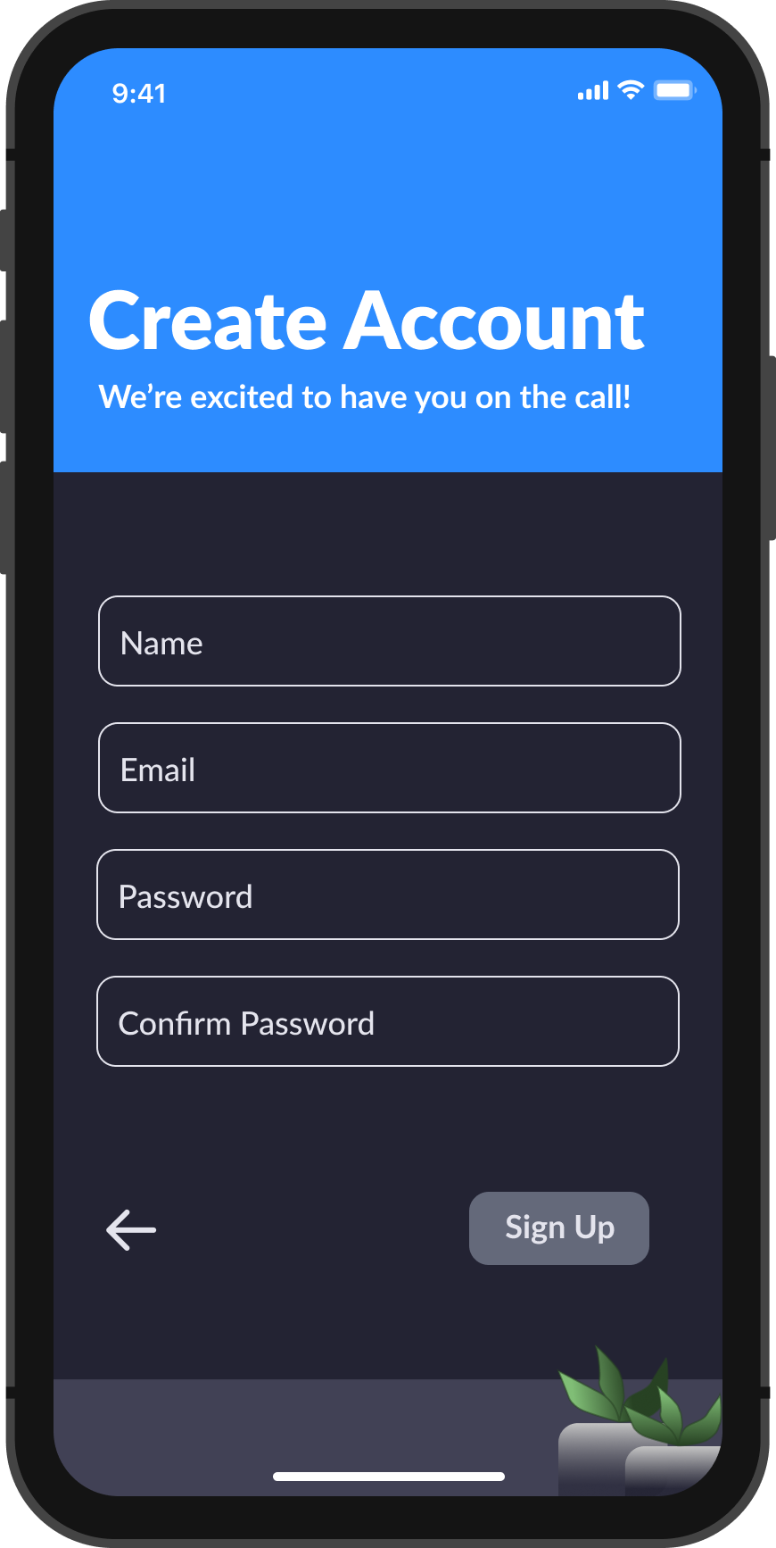
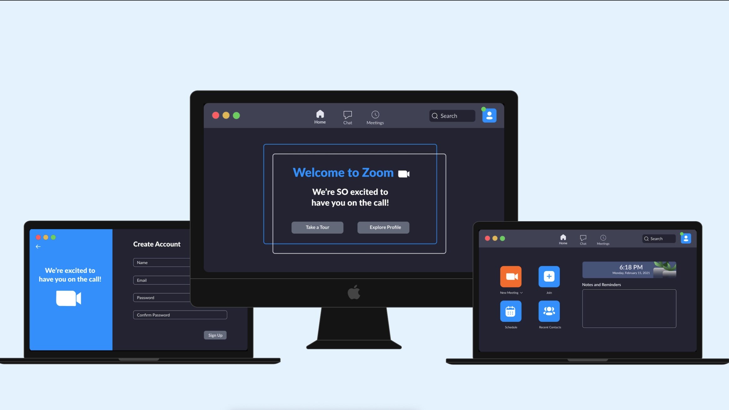
Final Designs: I created 10 screens (as shown below) that highlight the new profile features and the implementation of the new modern and clean aesthetic.
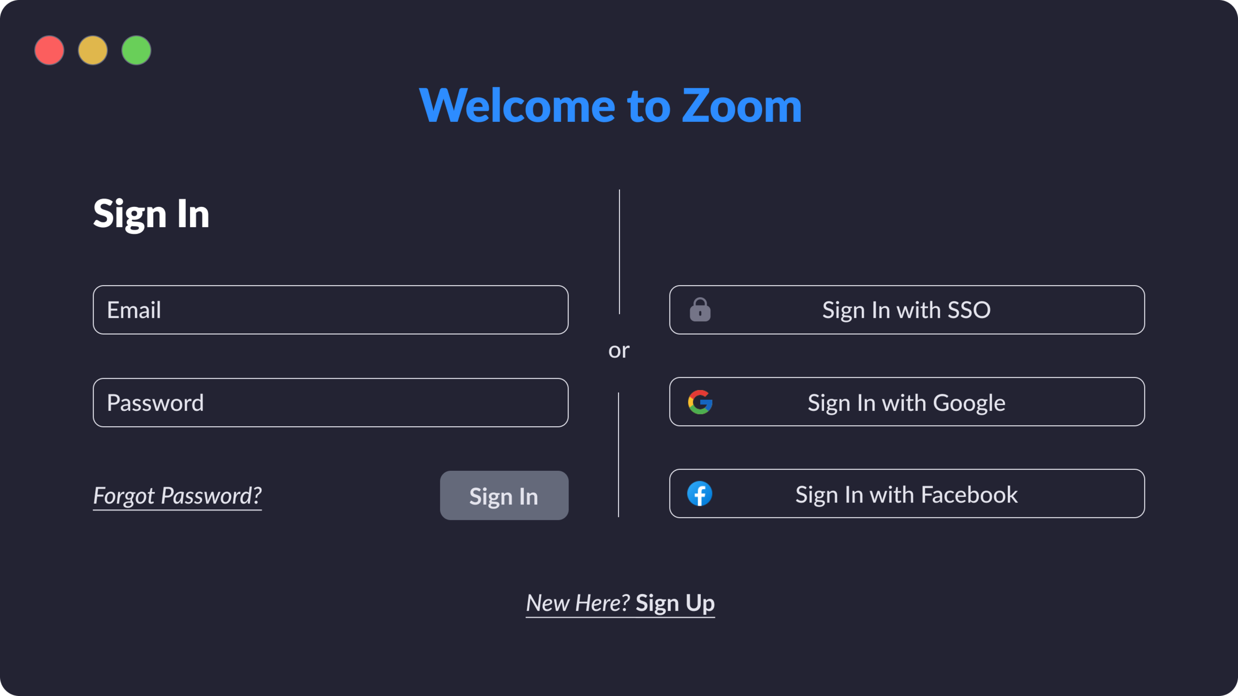
Zoom Sign In Screen
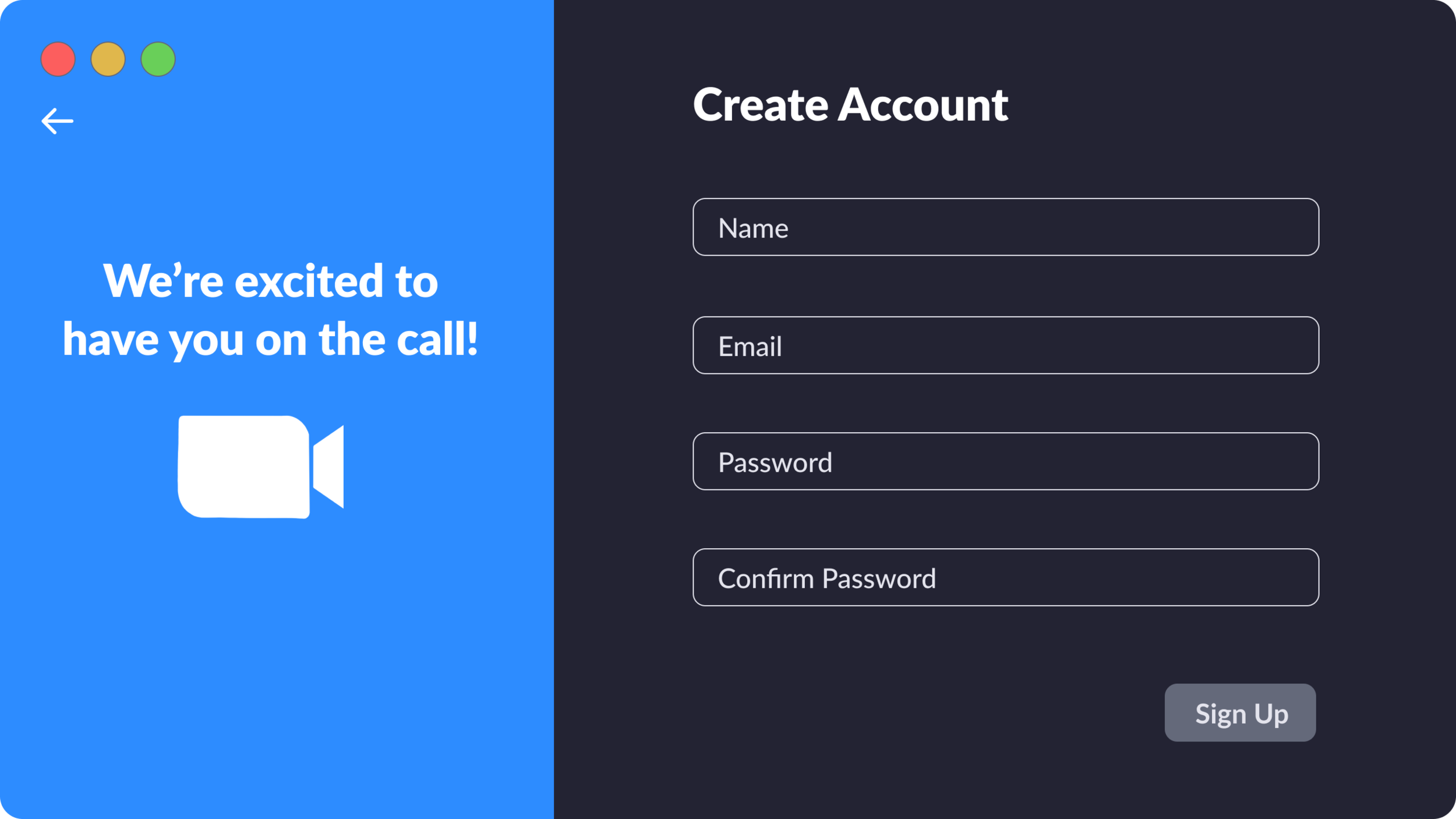
Create Account Screen
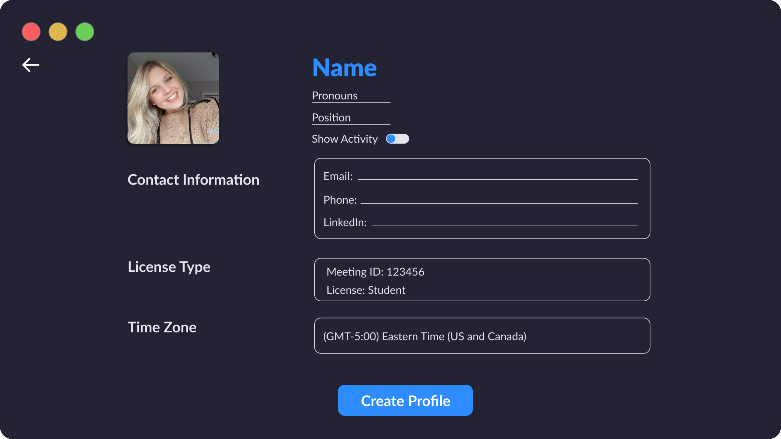
Create Profile Screen
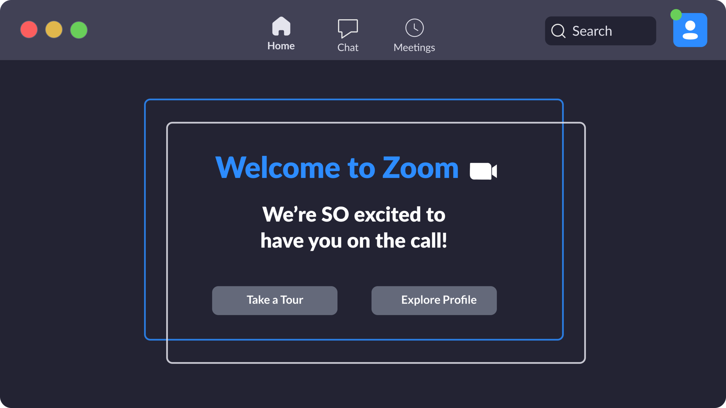
Zoom Welcome Screen
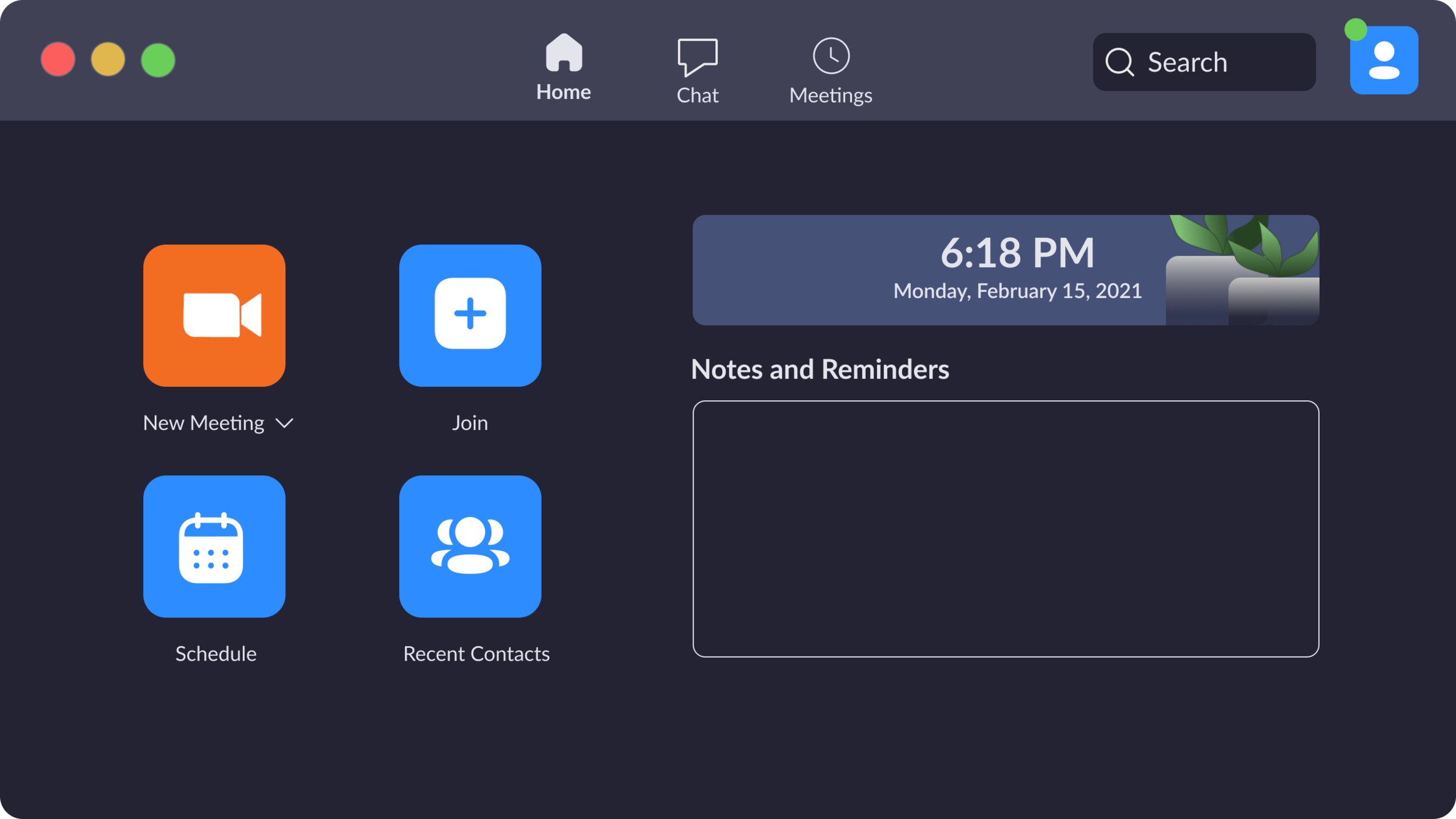
Account Dashboard Screen
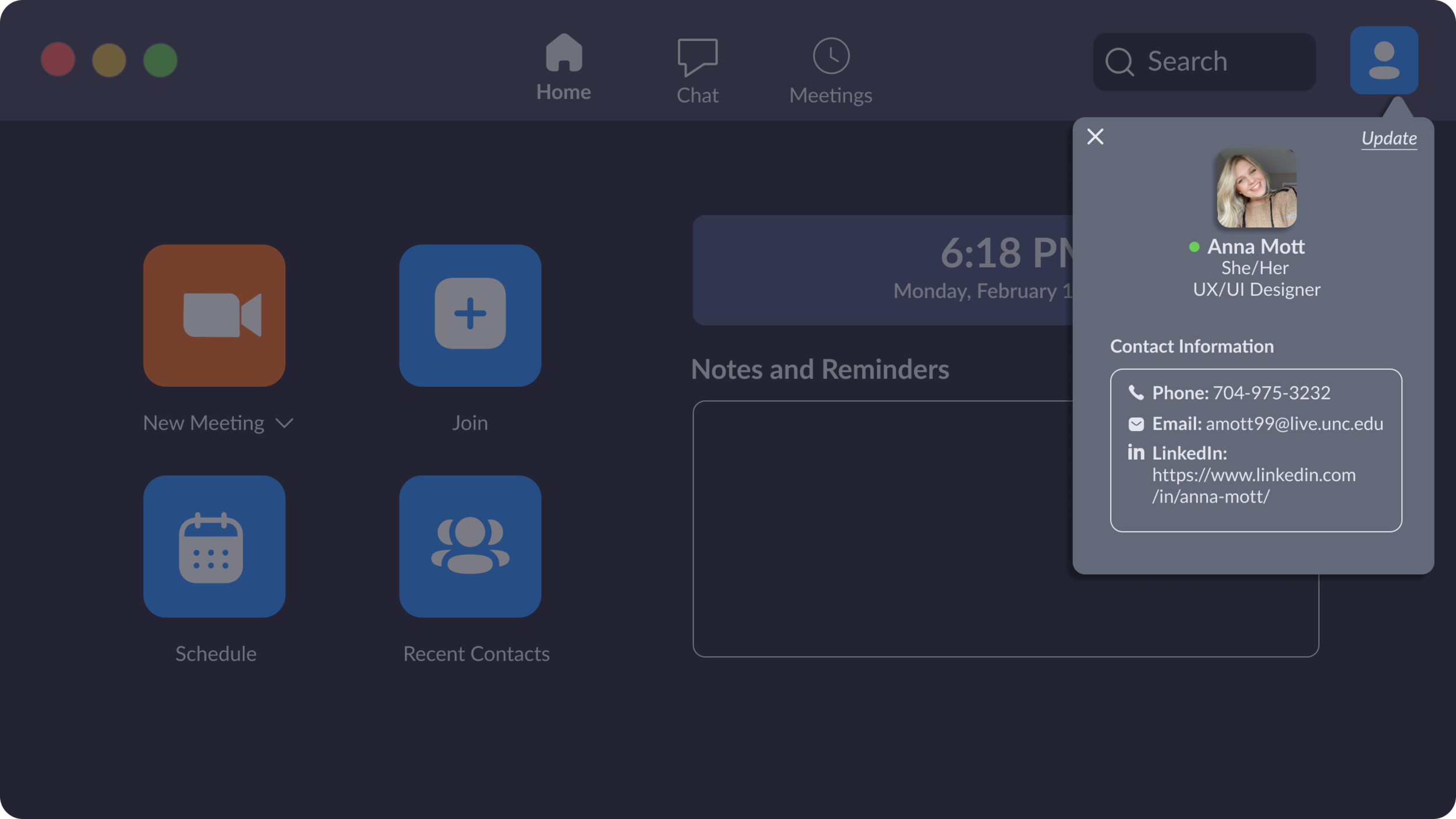
Profile Example Screen

Join Meeting Screen
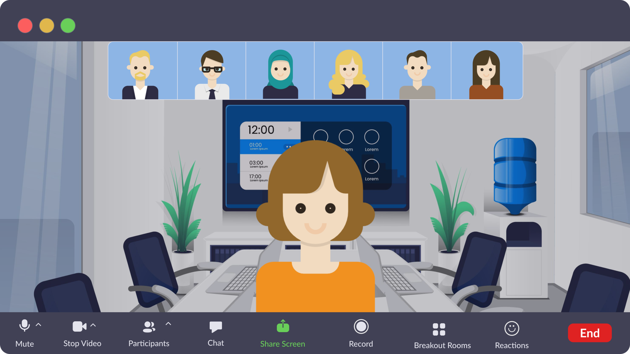
Meeting Screen
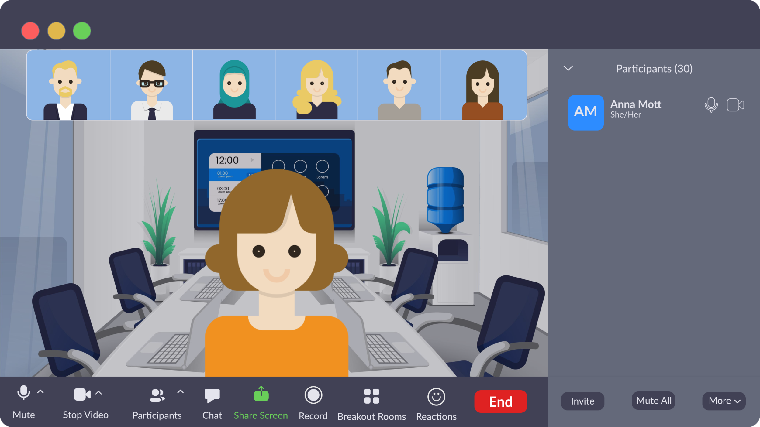
Meeting Screen: Participant View

Meeting Screen: Participant View With Profile Dropdown
Mobile Screens:


